When working on a interior scene one of the most obvious, yet most skipped thing when it comes to shading is the walls of the room. What i mean by this is simply that people usually go and choose a color for the wall and call it finished. This is not wrong on a first look, but if you turn around and look at your walls (provided they are not wallpapers) you will notice that no matter how new or well done your wall is there will be some texture to the wall be it from the concrete, or maybe even from the brush that the wall was painted with. Now this information is very subtle and since we have been watching it all of our life we don’t give it too much importance, but the thing is that when you see a render without it your brain starts noticing it and your scene starts looking a bit fake. So as the old saying goes “The Devil is in the details” so every little bit of information that you can put into your scene that will make it more realistic is something that you should find a way to incorporate it into your scene.
You can either use what you see in this video on any of your scenes, or you can use the scene that i am using by grabbing the file from the post Realistic Interior Lighting.
In the following video i will show you how you can take your scenes and start adding in details that will make it more realistic. We are going to start with a simple bump map to give it some basic details, then we are going to mix it up a bit by using a VrayBlend material and take two materials with different surface and see how they are going to look. After that we will add a third layer that will have diffuse texture as well as bump to it, but instead of using it only for blending the bump we are going to make a mask in Photoshop and then use it to make our walls look old and riddled with damage and wear. So if this is something that might interest you on how it’s done, then check out the video.
So i hope you liked this video and you managed to learn something new, and like always when i finish a post i tell you that if you liked what you saw you can help spread the word by liking on YouTube and Facebook, share and comment so it could reach more people and hopefully help someone else the same way it helped you out.
In today’s article we are going to take a look at one of the most common issues that plagues people that choose to work with 3D modeling and adding textures, and this is called non tileable textures. When you start using textures for the very first time in your scenes you are going to come to the realization that your “raw” unprepared textures are lacking when you want to tile them and make them smaller. The two most common issues that can come up are that your textures haven’t been color equalized which can lead to having different hue values across your texture, and the second issue is with the texture not being seamless. Seamless textures are textures that don’t leave a visible border when you tile them. What is important to note here is that the advantage of using seamless textures is that it has a lot of potential for reusability. What this means is that you can use it again and again opposed to a texture that you would make for an unwrapped model that would be custom tailored to that model alone.
Ok since i don’t want to make this a very long post where you have to get bored of reading i’ll go over the highlights and i’ll let you watch the video. You will see me get an image from Google, then use it in the scene from Realistic Lighting With V-Ray post, and there we’ll see the issues of tiling and color balance showing up, then in Photoshop you will see How to Equalize the Texture color and then how to make it tileable, and after that we are going to save a Diffuse, Specular and Bump map and apply them on the floor in our scene.
Just in case that for some reason you weren’t able to find the texture that i used from Google image search feel free and download it directly from here.
As you could see creating seamless textures is not that complicated and pretty much anyone can do it if you follow the simple guidelines in the video. I hope you guys learned something today and that you enjoyed the video, and If that is the case then toss a like on the facebook page, subscribe to the YouTube channel, like and share so it can reach more people.
Starting up with a new render engine can be a daunting task, especially if you worked with a different render engine for a while, Mental Ray or standard materials as an example. The main issue usually starts up when you don’t know how to make heads or tails of the settings and the materials of the new render. Well in the Starting With V-Ray series we went into depth on explaining the main settings for V-Ray and now in this post we will try to explain how the textures work in V-Ray. So brace yourselves as i think this is going to be a longer post, so lets just jump in right in the deep.
I went ahead and made this into a video as well trying to explain the things that i went over in this post. I would highly recommend that if you want to understand how the materials in V-Ray work that you take some time and go over this post (WALL OF TEXT WITH PRETTY PICTURES) and hopefully clear up any things that aren’t completely clear.
When you change your render from the default scanline render to V-Ray the one of the things that you will notice is that now your materials have been converted into V-Ray Materials (In order for this to be the default, you need to change it into the Customize – Custom UI and Defaults Switcher). The first thing that you are going to notice if you did it is that the material balls will be colored as you can see on the image here. This is a feature that V-Ray has implemented to make it easier to differentiate the materials, but if you ask me i would rather they kept it at the neutral gray, but then again it’s my personal preference.
The main thing about V-Ray materials is that even though it looks and feels like it’s complicated to deal with it, in reality V-Ray materials are basically created by tweaking three different parameters, Diffuse (main color), Reflection (self explanatory) and Refraction (the ability to let light pass through it)
Lets start from the beginning, namely how do we change the diffuse color of our material. That is quite simple and all you have to do is click on the color tab next to the diffuse (labeled 1).
Once you press the color tab you will get a color pallet looking like the one on the image shown below here. This color pallet is a fairly useful as it gives you a lot of leniency and flexibility when selecting the color that you need. We can separate it into a couple of different groups that would make it easier to explain it.
*The first type of selection would be the selection by Hue in which you can select it my clicking anywhere in the selected field (marked with 2).
*The second thing that you can control here is the brightness of the color you have selected (marked with 3)
*The third is the RGB value selection. This here is a very helpful way of selecting as many times you would get a RGB value from a client for a color that he has in mind, and having a field where you can input the different values is of immense help (marked with 4)
*The fourth way is a combined selection method where you visually choose from the Hue, Saturation and Value from the sliders shown with the field (marked 5)
So all this that we saw here so far is if we want to have a solid color for our diffuse, but in case we want to make a material that has an image or some pattern as a base then we have to add a bitmap, or a procedural map in the diffuse slot. The way to do this is you need to click on the little square next to the diffuse color picker and choose either a bitmap or a procedural map.
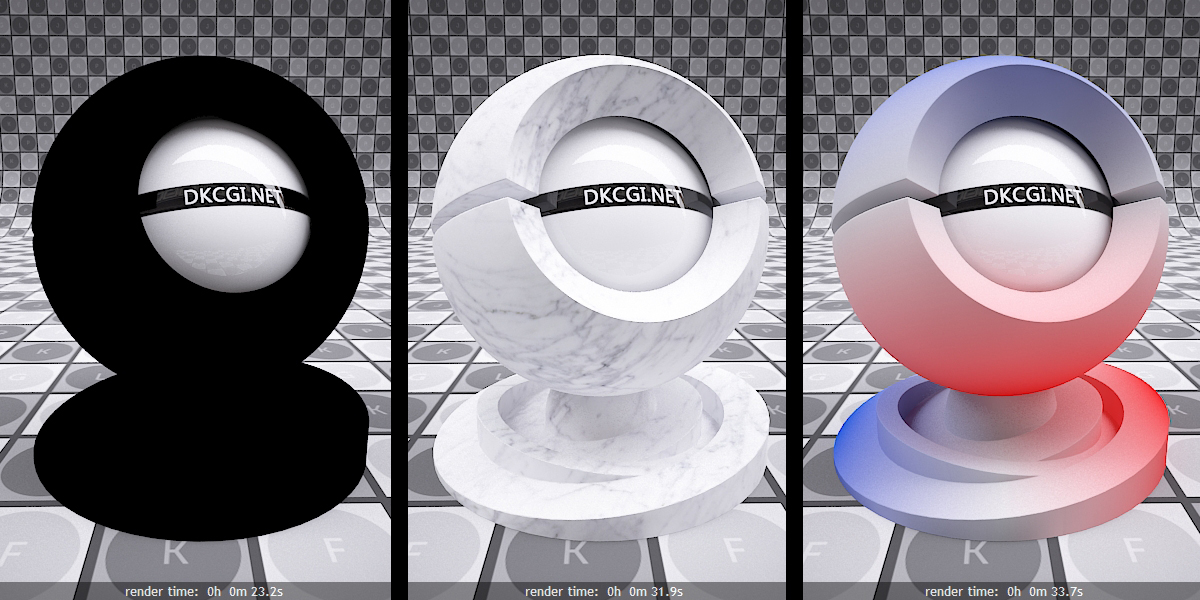
On the image above we have a few different diffuse results. On the first one we have pure black color, that can be seen on the material ball on the left. Then the middle ball has a texture applied to it, and on the last one we have a procedural map where we can see the colors going from Red to White and Blue.
So what we need to understand here is that the Diffuse is the MAIN Color of our material.
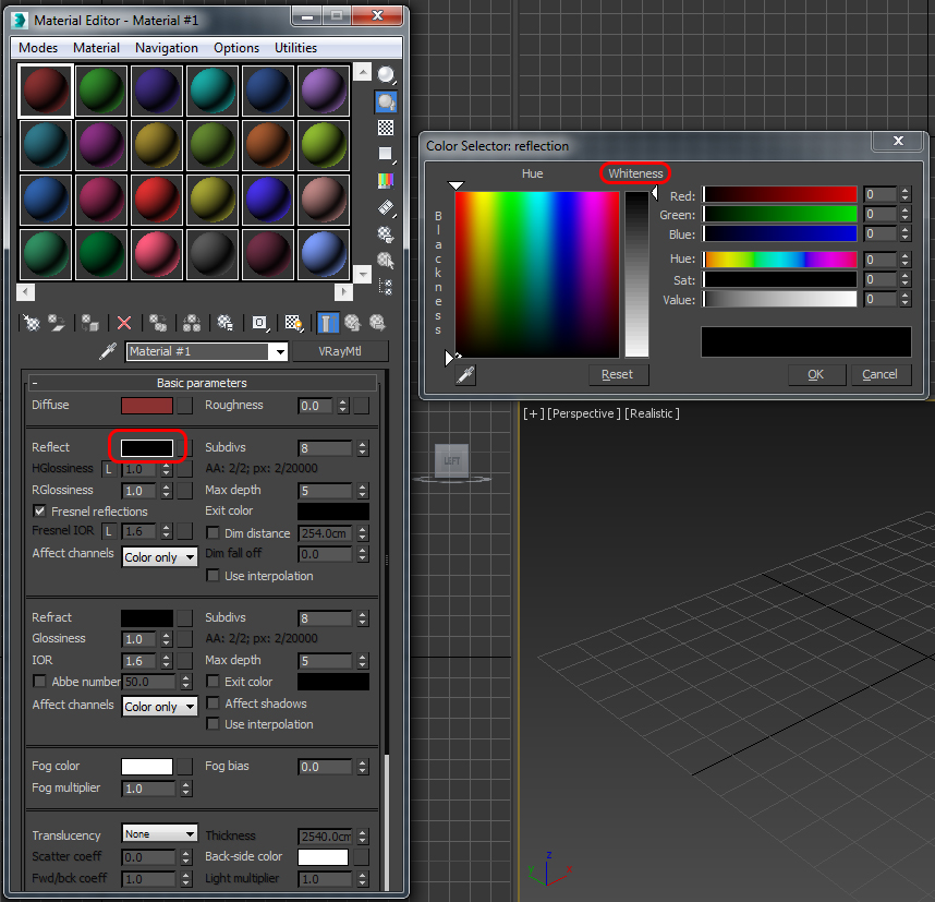
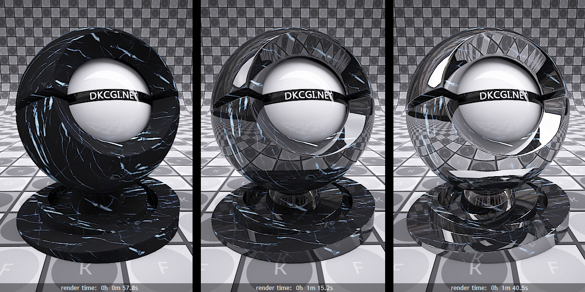
The next in line is the reflection slot. As we mentioned earlier the reflection slot plays a big role in the final outcome of the look of our material so knowing how to control it is important. In order to get to the parameters to control the reflection you need to click on the color picker (marked on the image) and you will get the same color pallet as you saw in the diffuse section. Now here is where it starts to get interesting as the reflection is directly controlled by the Whiteness parameter. This means if the chosen color is black or a value of 0 you will have no reflection, while a white color or a value of 255 will mean a 100% reflective surface.
So to sum it up before we move onto examples, the percentage of 0-100% reflection is controlled by 255 segments in the Value color.
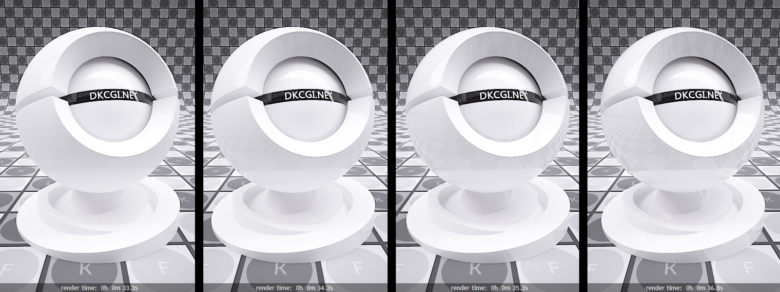
If we take a look at the image below we will see the reflection changes depending on the value we have selected. Going from left to right we can see how a 25% (64 value), 50% (128 value), 75% (192 value) and 100% (255 value) looks like when applied to a white material. (click for a larger size image)
While we are still at the reflection parameter we need to take a look at the Reflection Glossiness parameter as well. This parameter basically defines how blurry your reflections are going to be. The way to control the glossiness is through the numerical value of 0-1, where 1 is 100% shiny while 0 is 0% shiny. Now before you take this for granted i want to note one more thing, and that is that the majority of the materials you are going to be building will move from 0.5-0.99 range. There shouldn’t be any reason to go below a range of 0.5 as with a 0.5 or 50% shiny reflections you will get some really blurry reflections, and you want to be weary of really blurry reflections as they love to gobble up rendering power and in turn ramp up your render times.
While we are still at the Reflection we need to cover one more important thing, and that is the reflection color. When you are choosing the reflective intensity of your material you basically choose it from the Whiteness level of the color selector that goes in 255 increments of White-Gray-Black. Now in case you don’t stick to the black and white gradient of the whiteness levels and choose to manually select a color in the reflection slot, in that case V-Ray won’t simply make your Reflections stronger or weaker but in turn it will add coloring to the effect.
Now the reason why i mention this is because the way that colored reflections work is a bit tricky due to something called Energy preservation mode. By default this can be seen in the Material editor options roll down menu as shown on the image above, and the default setting is set at RGB. With an RGB Energy Preservation mode active the colored reflections that we choose for our materials will act weird in the sense that if you add red color in the reflection slot, instead of getting red reflections you will get reflections where the red color has been taken out of the reflection of the material.
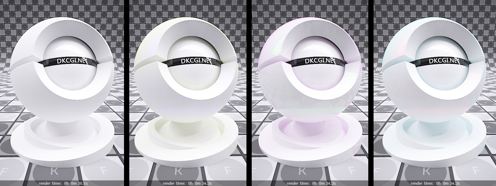
If you look on the image below you can see exactly how that looks like. On the four examples below you can see a material with (Left to Right) Black, Blue, Green and Red. And no i didn’t mix up the color places. The reason for the Blue color to appear Yellow, and the Blue to look Red and the Red to be Blue is due to the RGB energy preservation mode, because as you know all colors can be achieved with mixing Red, Green and Blue so once you take out one of those primary colors you get unexpected results.
With this in mind it might sound like getting controllable colored reflections would be near impossible with V-Ray, but that is not the case. If you want to get reflections that are colored all you will need to do is switch the Energy preservation mode to Monochrome. In the image below you can see how a material with Monochrome reflections looks like. We have a Red, Green and Blue colors in the reflection slot and they are perfectly shown in the reflections as well.
And the last thing that i would like to mention about the Reflection portion of the parameters is the IOR (Index of Reflection). The IOR is basically the angle at which you are seeing reflections. In V-Ray 2.x versions the Fresnel Reflections (IOR) is turned off by default while in 3.x it’s turned on. This IOR value actually has a pretty big impact on how our material is going to look like and the values range from 1 to basically infinite, but anything above 40 is hard to notice any difference. If you take a look at the image below you will see three examples of different reflections with different IOR values. So basically we have a IOR 1 and with that value we have no reflections as the angle is too steep for reflections to show up, then we come to a IOR 2 and we can see reflections forming up nice and realistic and in the last image we have IOR 6 value and a very reflective surface.
So to keep it simpler, with higher value for the IOR you will get more of the environment to reflect into your materials. If you want to get some realistic values for IOR’s then simply Google the phrase “name of the materials you want” IOR value. HERE IS AN EXAMPLE OF A SITE WITH ALOT OF IOR VALUES.
So off to deal with REFRACTION now. Refraction is basically how much light can pass through a certain material, or simply put how transparent a material is really. The way to control the transparency is pretty much like with controlling the reflection with the Whiteness value. On the image here we can see how a material looks like with 0% Refraction, 50% Refraction and 100% Refraction
Now similar like with the reflection, we can use a color in the refraction slot, or we can even use a bitmap texture if we want. In the image below we can see the result that we get if we use a color, procedural texture (Gradient Falloff Red to Black) and a Bitmap texture in the last case (In retrospect i should have used a different color bitmap to make it different, but hey it’s done so there)
So if we take a look at the images that we got with adding color in the refraction slot we can safely say that it ends up looking like colored glass. Well when you want to get colored glass this is not the wrong way, but it’s not the right way either and let me explain why. V-Ray has the ability to portray colored glass much better then simply adding color in the refraction slot, it actually has a setting that is exactly for that purpose. This parameter is called Fog Color, and it can be found in the Refraction slot.
If you take a look at the images below you will see that we have added a blue color to the Fog Color, and the strength of the effect is directly controlled by changing the For Multiplier. In the images below we have a multiplier od 10 then 1 then 0,1 and the last has 0.01. The main difference when using Fog Color is that depending on the thickness of the model that it was applied the effect will be stronger on thicker portions while it will be lighter on the thinner parts. This is that extra bit of realism that we get, as this is basically how light reacts in the real physical worlds.
If you click on the little square next to the Fog Color then we can choose to use a bitmap, or a procedural map that will help us control how the glass is going to look like. In my case i used a gradient map that goes from Red to Blue, and you can notice how in the middle where the model is the thinnest we can see the transition of the colors is best visible.
So with this option available to us we can see that we have a very good control on how the glass coloring is going to end up looking like in the end, and when working with materials the more control you have over all the parameters the better the end result is going to end up being.
One thing that is worth mentioning here is that prior to 3.x version of V-Ray the option to add a map to control the fog color was not available, so in case you are using the 2.x version and can’t find the option to add a bitmap know that the reason for that is that it doesn’t come in your version of V-Ray.
And before we finish with this now rather lengthy post, i want to go over one more option in the Refraction menu and that is the Abbe option. This option can be found under the IOR value for the Refraction (if you are using 3.x version) and by ticking the box next to Dispersion (if you are using 2.x version). What Abbe is controlling is basically the dispersion of light inside of the model. This is ideal for materials like crystals and diamonds, and to some extent some types of glass. If you take a look at the image below you will see three different values for Abbe, a Value of 1, 6 and 50 going left to right. We can notice that with a higher value, the dispersion of the light is more localized and it is giving us a more crystal appearance.
So with all of this that we went over here in this post we should have the basics of the Diffuse, Reflection and Refraction covered. Knowing these things is the first step towards knowing how to construct your basic materials, as well as more complex materials.
Lighting up your scenes will either make or break your scenes. When i say break your scene i don’t mean like literally crush your scene, but if your scene lighting is not realistic then your entire scene will end up looking fake. By using V-Ray as your render for your interior scenes you can get some near photorealistic results if you know how to setup the general settings for the Global Illumination, the V-Ray light parameters and environment lighting parameters. Well in case this is something that you didn’t know how to do or tweak you are in luck as this post is going to cover most of the basics for lighting an interior scene with V-Ray.
Initially i intended to make this into one video, but when i started recording it simply got to the point when i had to make a choice if i want to have one long 50+ minute video, or break it down to two individual videos so that it can be easier to watch it. As a personal preference i hate watching long videos and prefer to stick to 30 min tops especially when it’s a tutorial video, but if you guys would prefer to have it all into one longer video leave your thoughts as a comment so i know what works better for you in the future. You might also want to check out the Exterior lighting with HDRI post to give you more information on how HDRI works. So lets cut it short with my ranting and lets get down to seeing what the actual videos are about.
In the first video we will see how we can light up our scene by using a V-Ray Sun, then we add an environment map and see what it does for our scene. After that though we are going to take a look at how to deal with the most common issues that arise when you are lighting your scenes like splotching, and general GI noise. But go ahead and watch the first video so you can see for yourself what i am talking about. Oh and after you are done with watching the first video come back and keep reading on as the second video is basically going to continue on the same scene.
Ok so if you are finished with the first video it’s time to hop on the second one and check out a few more tweaks you can do for your interior scene lighting. In the second video we are going to take a look at how we can light up our scene with an HDR Image, learn how to control the quality of the HDRI as well as how to control the shadow subdivisions and in turn control the noise in the shadow portion of your renders.
So after watching these two videos you should have some basic grasp on how lighting an interior scene is done with V-Ray. As you could see it’s really not that complicated to get around the basics of lighting with V-Ray. I hope this was helpful for you guys and girls and that you managed to learn something new today. If that is the case then toss a like on the facebook page, subscribe to the YouTube channel, like and share so it can reach more people.
When you get a project in which you need to model some exterior scene, there is a pretty good chance that you will need to either model a garden or maybe some flowers or even vines and ivy growth. This on its own can be a bit of a problematic issue if you have never had the need to do it, and frankly you don’t know where to start from. A perfect example for something like this is the image on the side where we can see some vine overgrowth on top of the column.
So if you want to learn how to model something like this you are in the right spot.
In order for you to be able to follow along with this video you will need to download a plugin called Ivy Generator from Guruware. (Click the link, in case it wasn’t obvious). Once there download the plugin and follow the instructions on how to install the plugin and as soon as it’s installed you should be primed and ready to follow along with the video.
A while back i remember that i shared some textures for leaves and foliage on the Facebook Page, so feel free and toss a like on there and scroll back and see if you can get to the textures. ( I know, shameless advertisement right).
In any case in the video you can learn the basics of the parameters that the plugin has, and also how to control the growth of the ivy in order to get it to take the shape that you have in your mind. You will see how you can make the vines grow on top of an existing mesh. Then we will see how to make the vines grow in a confined mesh. And after that we will see how to make it grow out of a given mesh and at the end we will see how to get the vines to grow on a brick wall geometry but keep the growth in the mortar and not on the bricks.
Again i hope this video was helpful for you guys and girls and that you managed to learn something new today. If that is the case then toss a like, comment and share it around so it can reach more people and maybe help them the same way it helped you. And don’t forget if there is anything that you guys would like to see, leave a comment on the site, or on the YouTube channel and i’ll see if i can make a video about it.
Ok so similar to the previous post where i got a request to make the post about the bed in Marvelous designer, i got another request to make a video about lighting a scene with HDRI images. So lets start from the beginning and first of all explain why should you use an HDRI for lighting.
HDRI stands for High Dynamic Range Image, which in turn means that it is an image that contains a lot of information, especially information that can be used as lighting information by V-Ray. The main difference between using HDRI and for example a single V-Ray Sun is that the HDRI emits light from all the sides depending on the image you have. So if you are using a HDRI with a cloudy day you will get an overcast feel to the scene, if you are using a sunny day HDRI you would get that same look, and on top of it all that HDRI can also be used to get some realistic environment reflections.
So now you know what HDRI does, but where do you get some high quality HDRI images? Well the answer to this question is not a straight forward one as it depends. If you are looking for a High quality HDRI for commercial projects then you probably want to go and actually buy some HDRI that range from 5000×5000 up to 40kx40k resolution, but if you are looking for some HDRI’s that you can use for your projects or in some cases you can even use them professionally check out HDRLABS. These guys are offering a wide spectrum of HDR images that are rather well done and give some nice results. Also there are multiple sites that offer freebies through Facebook ads, so you might want to keep your eyes opened there as well, and also you can Like check out my Facebook DKCGI page if you haven’t already and check out some of the older posts there as i have links to free HDRI’s and sites offering Textures.
Ok so since you know where to get HDRI’s now you can go ahead and jump over to the video. In this video you will learn how to add HDRI image to a V-Ray dome light, how to control the intensity of the light by changing the HDRI. Then i’ll explain why would you want to add a V-Ray sun to the mix and use both V-Ray sun and HDRI together, and even how to link them so when you are controlling one you are actually controlling them both and in turn getting a lot more control over the scene. So enough reading, feel free and go and check out the video.
So i hope this video was helpful for you and you managed to learn something new then like it, comment and share it around so it can reach more people and maybe help them the same way it helped you. Also if there is anything else that you would like to know ask in the comment section and i’ll see if i can make a video about that.
So if you are either working as a full time 3d modeler or maybe you are freelancing around, you are bound to run into the issue of having to model the infamous rattan elements. The reason why i decided to go all dramatic and call it infamous is because the geometry in the rattan models can be a bit tricky if you have never done it before and it can pose a problem. Now as i said it in the video, usually the way you would model something made out of Rattan would be to make the basic model and then slap on a texture give it some bump and reflection and call it done, but in some occasions where you would have a close up render you would have to model an actual model of the rattan.
On the image here you can see a compilation of a few different rattan baskets with different finishes, as well as one that is some sort of a table. I used these as reference images when i was making the video, but you can take pretty much any image from rattan from the internet and try to replicate the result.
As you will be able to see in the video the basic look of the basket will depend on the kind of weave that you will need for your rattan model. In the video i made a single horizontal weave going through double vertical poles, but you can use the same technique and change it around and make it resemble more like something that you need.
So talking aside take a look at the video and i hope that you will pickup on some tricks, and hopefully learn something by watching this video.
So like always, if this video was helpful to you and you managed to learn something new then like it, comment and share it around so it can reach more people and maybe help them the same way it helped you.
So we’ve all had the chance of seen hundreds if not thousands of cases of those awe inspiring renders that look amazing showing off mountains, rivers and nature. Well the moment you realize that you are looking at a CG image is the moment that you realize that someone had to do the terrain for that render. And if that doesn’t sound like something that you would ever need just think about the fact that if you happen to work on a architectural project you are bound to end up with the need to model the terrain surrounding your base model.
Modeling terrain in 3ds Max is not a very complicated thing, but if you have never done it before it might pose a bit of a challenge. In the following video you will see how to take an image and from it extrapolate the isohypse lines that define the contours of the terrain. From there we will see how to generate terrain from those lines in 3ds Max, and then how to better control the geometry and making it all quads.
Oh and one more thing, this is for those of you who are still reading this and haven’t simply jumped off to the video to see what’s going on there. Even if you know how the terrain compound object works, make sure you check out the last 3 or so minutes of the video you can see how to generate terrain by using a plugin called Splineland. This plugin is amazing for someone that is doing this on a daily basis, and can afford to spend the cash to buy it. I only scratched the surface with this tutorial about it but i might make a more detailed one in the future covering more about it.
So without making this any longer then it should be, check out the video so you can see what i was talking about.
In case you would want to follow along with the same image that i used feel free and get it from here, or you can get one from Google.
Having said all that i hope you guys learned something in the the process of watching this and you also enjoyed it. If that is the case then subscribe to the YouTube channel, share it around, like and help spread the word around.
OK so here we go again this week with another tutorial covering Marvelous Designer following last week’s pillow tutorials. I had a few people messaging me and asking me to make a few more tutorials about Marvelous Designer, more notably how to make a bed with wrinkled cloth simulations? Well i took some time and made these two videos that initially were supposed to be one video, but i kinda like to keep them in the range of 20-30 min so it ended up as two.
In the first part of the video you will see how i modeled the base for the cloth simulations in 3ds Max, then how to export it out so we can reuse that same model as an avatar in Marvelous Designer. In this video you can see how to model the side skirts of the bed, how to make it so it’s wrinkled opposed to being flat and boring and also how to add the lower part of the wrinkles that is even more detailed. If you are interested in that check out the first part of the videos.
In the second part of the video we will continue where we left off in the first one and starting modeling the rest of the bed. We are gonna take a look at how to model a nice looking sheet covering the mattress, then continue and show you how to swap avatars, then over to modeling the pillow and placing it into position and at the end go down to modeling the blanket. After all of the elements are modeled we are going to take them and export them out and re import them back in 3ds Max and deal with the scaling issue. So instead of me explaining on what’s in the video have a look for yourself.
Now while i was making the video i didn’t notice it right away, but once it was made i did see that my blanket did come out a tad bit too short, so if you are modeling your version by following this tutorial feel free and make it longer.
So i think this should cover the basics on how to make a simple bed with 3ds max and Marvelous Designer, but don’t be fooled by the simplicity of our model here, if you use the same techniques that i used to make this model you can create multiple high detailed, interesting looking models as well.
If you guys have any questions about anything that was shown in the video feel free to ask in the comments below, or if there is anything that you would like to see a video of how to make it do write it down in the comments and i just might make a video about it if my time allows for it.
Having said all that i hope you guys learned something in the the process of watching this and you also enjoyed it. If that is the case then subscribe to the YouTube channel, share it around, like and help spread the word around.
Working as a interior decorator, or even as a freelancer you are bound to get a project that will be about modeling a room interior. One of the things that rooms always tend to have is a bed, or some kind of a sofa and some pillows on top of it. Well in today post i want to show you guys how you can model three different pillows, where the three will be with a different level of details depending on your need for complexity. This will be broken into two videos in which you can see how to model the low and medium detail pillows in 3ds Max while for the higher detail pillow we will go into Marvelous Designer.
In the first video you can see how to model the low and medium detail pillows, as well as how to put in some piping. So enjoy the first video and then check out the second one.
So if you have seen the first video you can now continue with the second one and see how you can make a high detailed pillow in Marvelous Designer that can fit into any scene that you might have, and the more important thing is that since we will be working in Marvelous Designer the model will actually be a simulated cloth which should behave like a realistic pillow would. So enough with my rant, enjoy the second video as well.
If you are still reading this you either saw both of the videos and came back to comment on something or ask a question in which case i salute you, or you didn’t watch the videos and you should feel bad, naah actually you shouldn’t feel bad you should just watch the videos 🙂
Having said all that i hope you guys learned something by watching this and you also enjoyed it. If that is the case then subscribe to the YouTube channel, share it around, like and help spread the word around.